I love living in my apartment but with apartment living comes very few opportunities to personalize your space to your liking. Additionally, you cannot make any permanent changes so that really limits your options. In my apartment, we have a wall in our living room that was just really blah and needed some TLC. After throwing some ideas around with Eric, we decided that we wanted to try to upgrade it in a manner that was both inexpensive and easy to remove down the road. So we decided to spruce it up with some brick peel-and-stick wallpaper and some new artwork. Let me show you how we updated our apartment for under $200 with just a few easy upgrades!
How We Updated Our Apartment Wall:
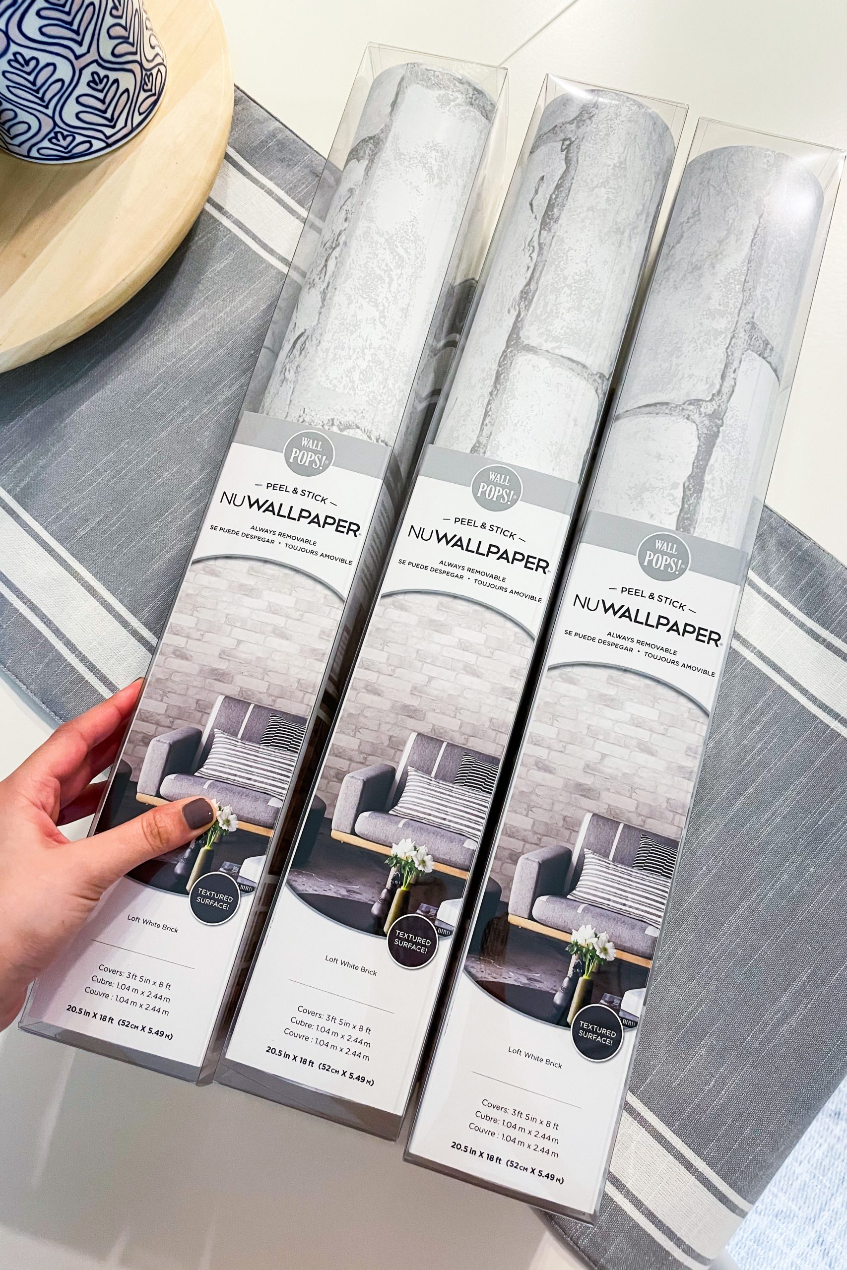
First, we bought a peel-and-stick wallpaper in a Loft White Brick pattern from Lowe’s for around $39 a roll (linked below). To cover our entire wall, we needed 3 rolls. When picking out a peel-and-stick wallpaper, it is very important that you read their reviews. Be sure to pay attention to these reviews to see if anyone had problems removing the wallpaper later on. You don’t want to buy a peel-and-stick wallpaper that will remove paint off the wall when you try to remove it.
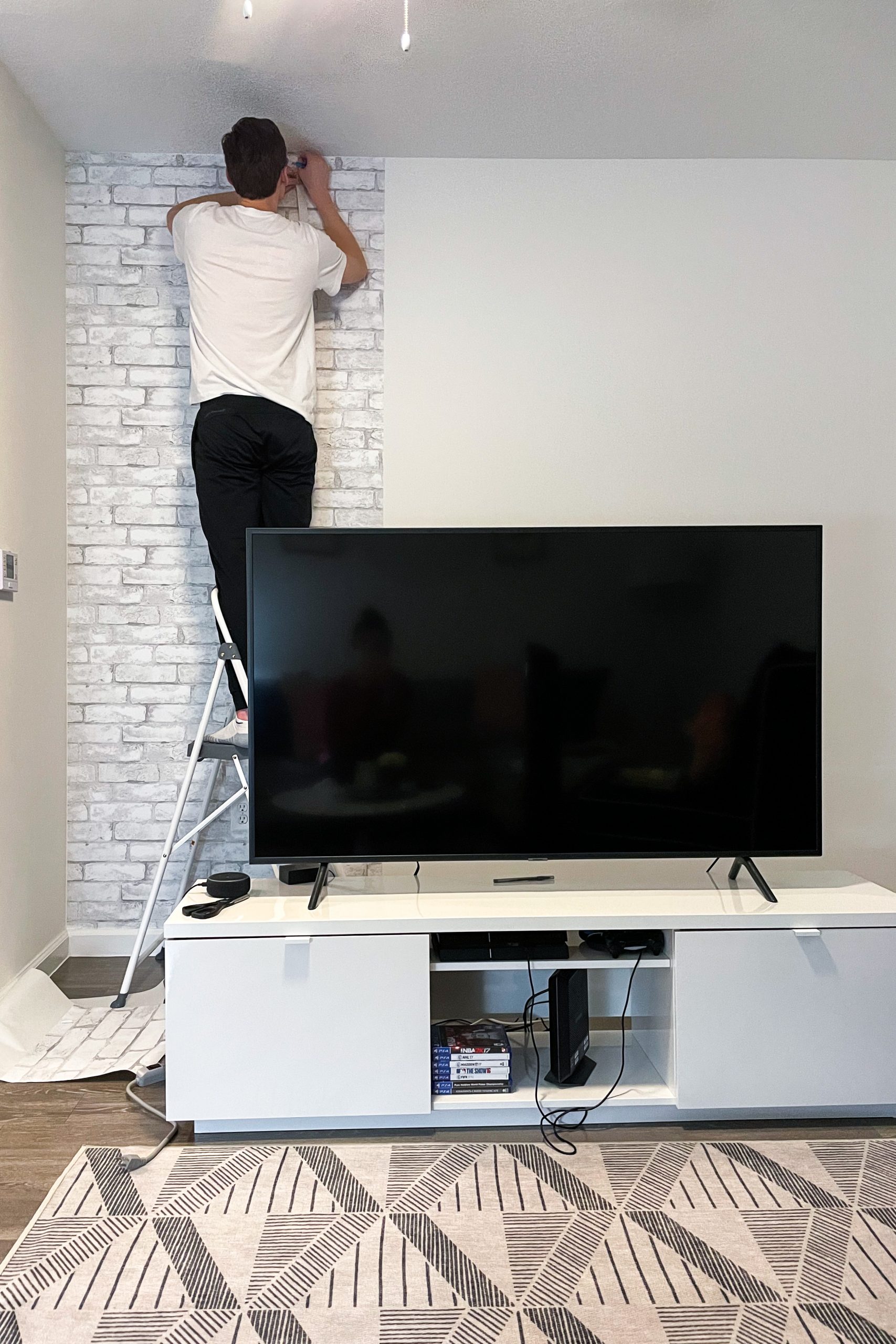
Next, we applied the peel-and-stick wallpaper to the walls. Eric and I applied this together as it was a two person task. To make this process easier, we bought a peel-and-stick wallpaper application kit for $5 (linked below). It allowed us to apply the wallpaper evenly as we moved down the wall and also remove any unwanted edges. The hardest part of applying this peel-and-stick wallpaper was making sure that the seams lined up properly. It took us a few tries but we did eventually get the hang of it!
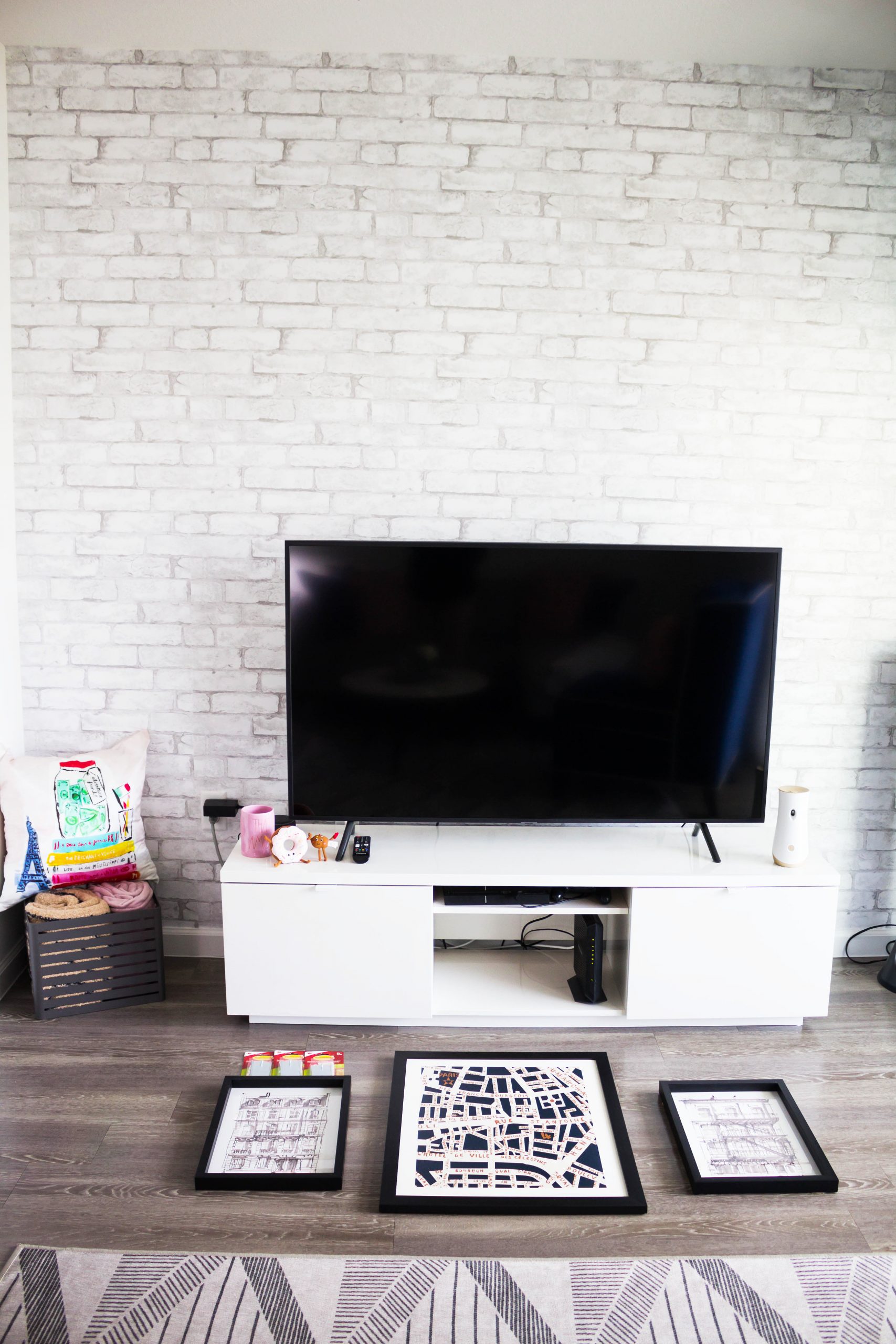
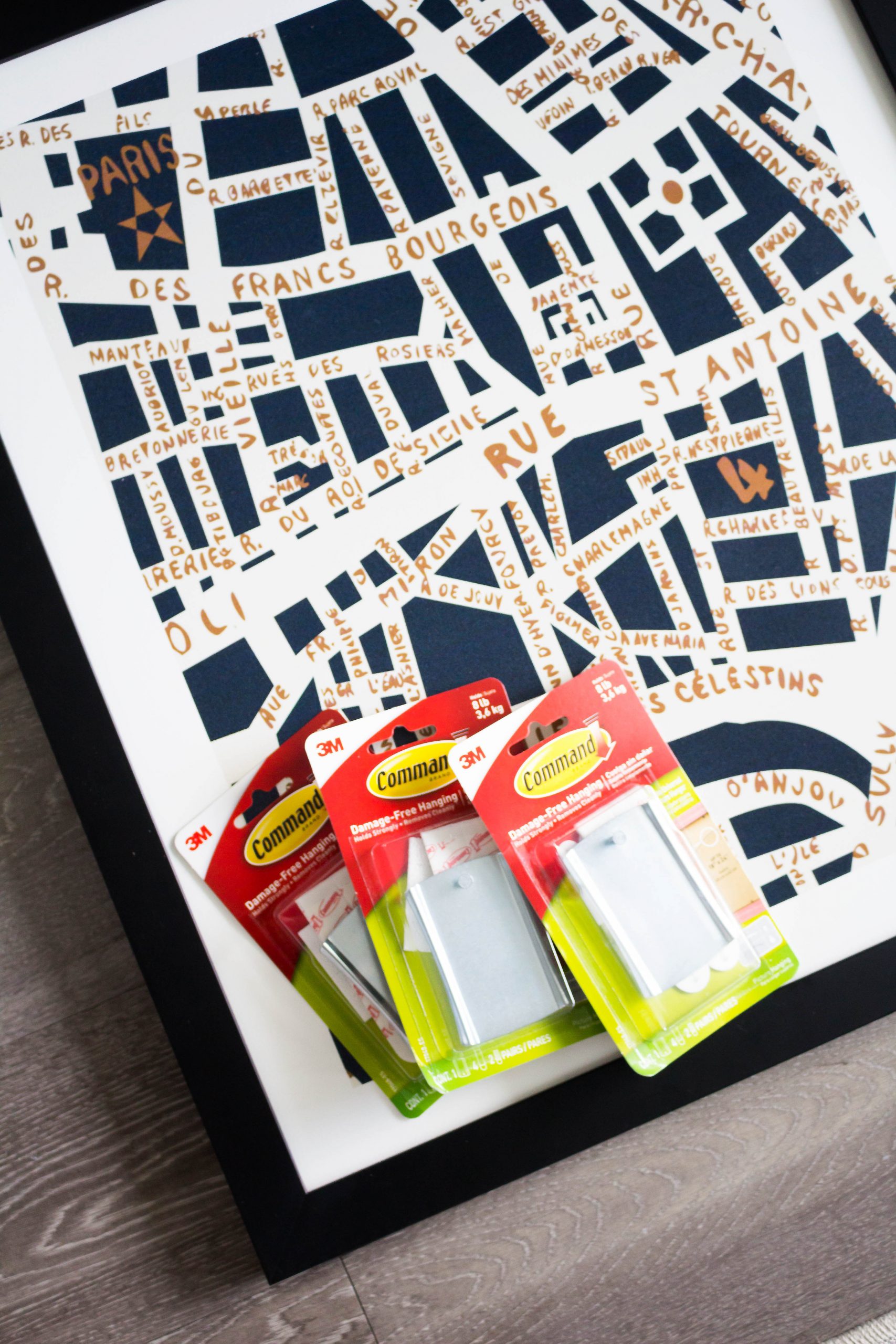
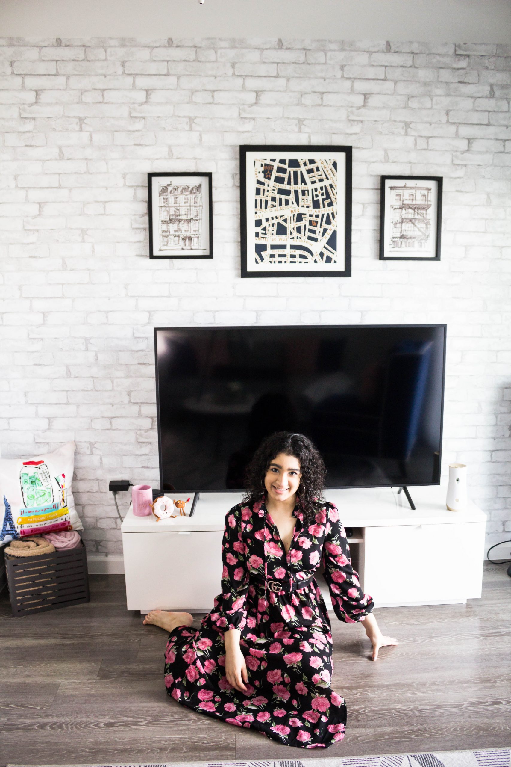
Once we finished installing the wallpaper, it was time to add some wall art. To hang our photos, we used the Command hooks with a nail attached (linked below). They are super easy to install and can be peeled off easily upon removal. For our wall art, we choose to hang a larger piece in the middle with 2 smaller pieces on either side. The larger piece that we chose was a map of the streets of Paris; the smaller pieces were of some black and white skyscrapers. (We found the smaller pieces at Hobby Lobby but I am unable to find them online to share. The larger photo is from TJ Maxx/Marshalls and I will link it below.)
Lastly, we hung everything on the wall and made sure it was all even with a level.
The Finished Product:
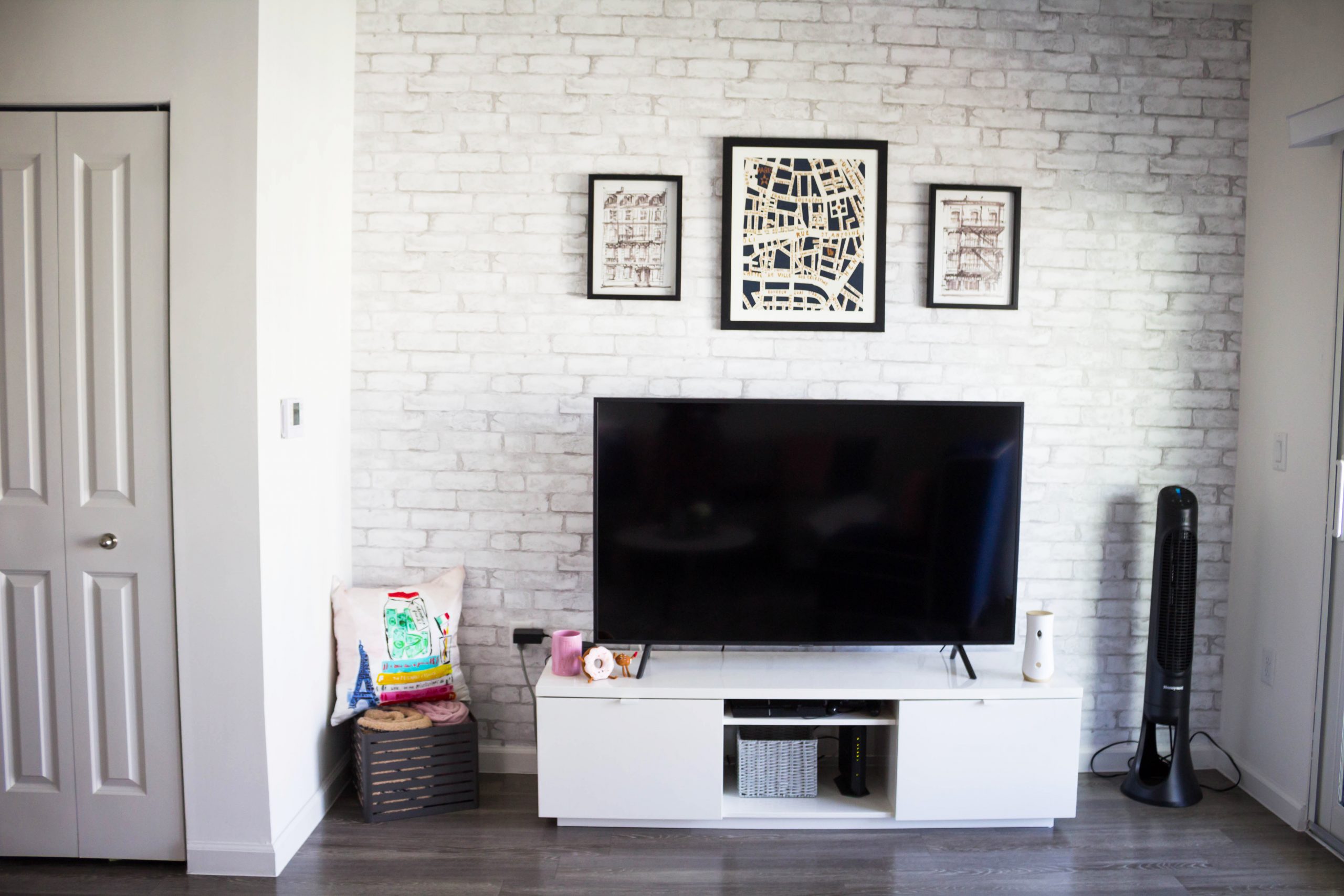
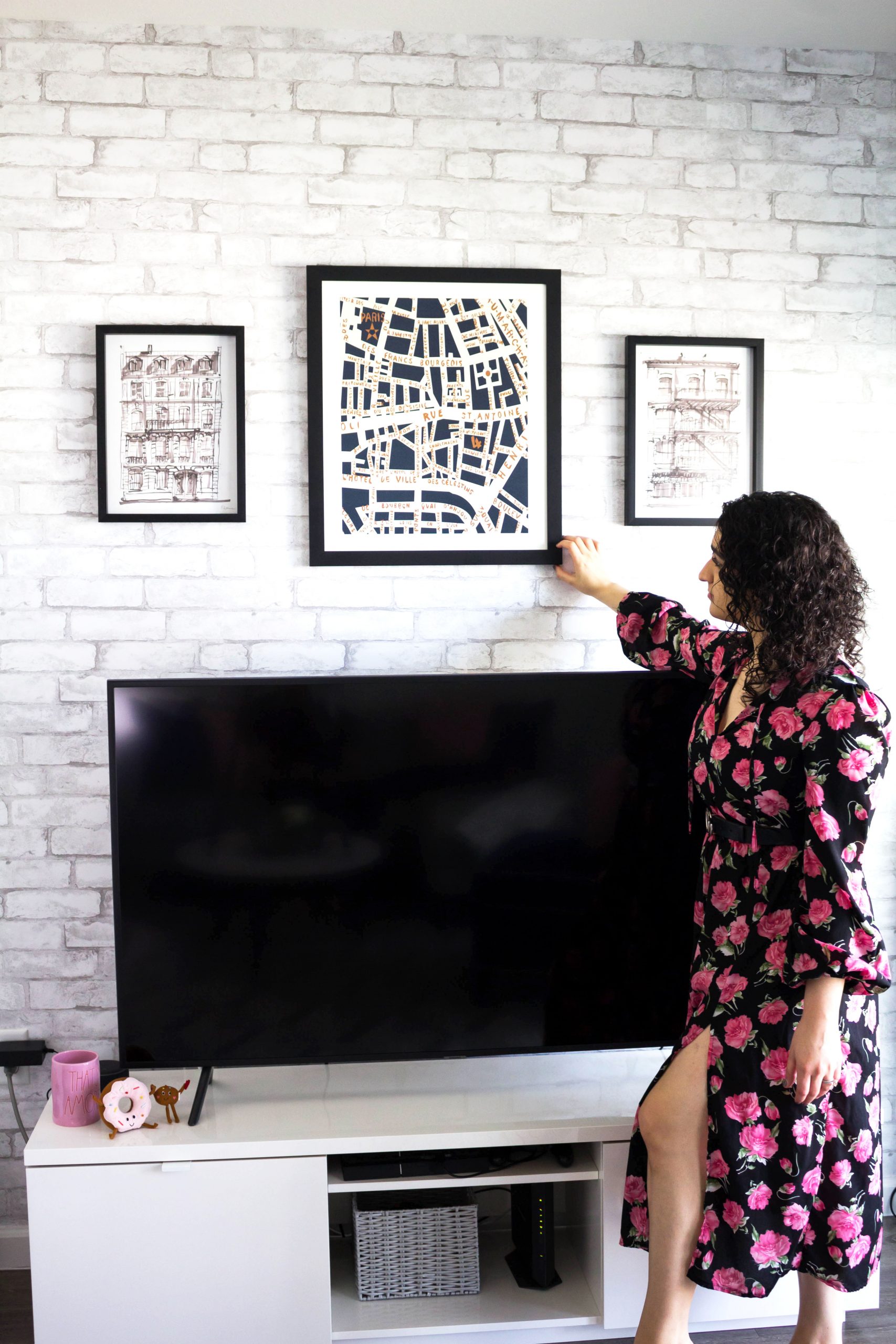
Here is the finished product! I absolutely love this update! It definitely gives the apartment a pop! It only took us around 2 hours to complete and was definitely well worth it.
Below are the links for all of the items that I used in this project:
If you don’t already, be sure to check out my Instagram for more Reselling Tips at @ RecycledRosesGuide (Click HERE)
To get email notifications for my next blog post and to receive my monthly Reseller Recap (with freebies), sign up for my emails below:
Baci,


